A person with healthy eyes can see more than 16 million different colours! With so many options, it may be very daunting and frustrating for a beginner to choose from so many colours when trying to start an artwork. By knowing the different properties of colour, colour picking can be easier. On most digital painting software, different colours can be picked by varying the hue, saturation and brightness. For traditional painters, they may also be familiar with the terms: tint, shade and tone.
Picking the right colours is a crucial part of creating your artwork, the colours you choose can make or break your artwork. In this post, I shall try to list out the main colour properties and attempt to describe what each of them means.
Hue
Hue represents a pure colour, regardless of the saturation and brightness, colours with different saturation or brightness can have the same hue.
Some examples of Hues are: red, yellow, blue, orange, green, purple. They are the primary and secondary colours on a colour wheel.
In the example below, even though all the colours are all different, they all have the same hue: red.
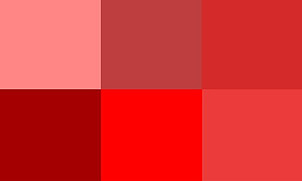
In a way, it’s like the answer you will get from a kid when you show them a colour and ask them to name it. For example, a kid is more likely to say red when shown crimson, or blue when shown cerulean.
Saturation/Chroma
Saturation or chroma of a colour refers to the intensity of a colour, or how pure the hue is.
Imagine adding coloured dye in a glass of white milk, as you add in more dye the red colour gets more and more saturated or intense until it turns completely red and can no longer be even redder.
Here is an example of various percentages of saturation of the colour red from white, with brightness/value constantly at 100%.

Value/Brightness
The value or brightness of a colour means how light or dark a colour is. Lighter colours are said to have higher values and thus darker colours have lower values.
Values can do lot’s of amazing things in a drawing, a lack of value variation can lead to a flat or 2D looking image, using a range of values can create more dimensionality and volume. It is important when trying to draw forms or realistic things. However, if your goal is to create a 2D looking artwork, then values may not be too much of a concern.
Tint
Different tints of a colour can be created by mixing the colour with white
It desaturates the hue, making it look paler. it usually results in pastel colours. Pastel colours are known as soft colours that are pleasant and nice to look at as they are not very intense.
The example below shows the results of different percentages of white added to a pure red colour. The colours may appear to increase in value as more white is added, however, that is not the case. The values of all the colours shown below have the same value.

Shade
Different shades of a colour can be created by mixing the colour with black.
It darkens the value. The saturation remains unchanged.
The example below shows the results of different percentages of black added to a pure red colour.

Tones
Different tones of a colour can be created by mixing the colour with grey.
In a way, it is a combination of tint and shade since black and white create grey.
It darkens the value and desaturates the hue. Since it’s a combination of tint and shade, both the value and saturation changes.
The example below shows the results of different percentages of grey added to a pure red colour.

A quick summary
- Hue – the colour family the dominant colour comes from.
- Saturation/ chroma – the intensity of a colour.
- Value/ brightness – the brightness or darkness of a colour.
- Tint – adding white to a colour, changes only the saturation.
- Shade – adding black to a colour, changes only the value.
- Tone – adding grey to a colour, changes value and saturation.
So these are the basic properties one has to know when choosing colours. By varying these properties, millions of different colours can be made. Knowing these properties can allow you to pick colours more effectively.
Hope you enjoyed reading this post.
You may also be interested in:



2 Responses
Thank you for the information. It was always difficult for me to understand these terms whenever I saw them especially while editing a photo and in today’s world editing images and videos has become a need for social media. I was always confused between tint and tones..:P
Thank you for clearing the difference between them for me in a very simple way.
Hi! Glad my post helped! It was very confusing for me as well when I first started learning these terms. Thankyou!