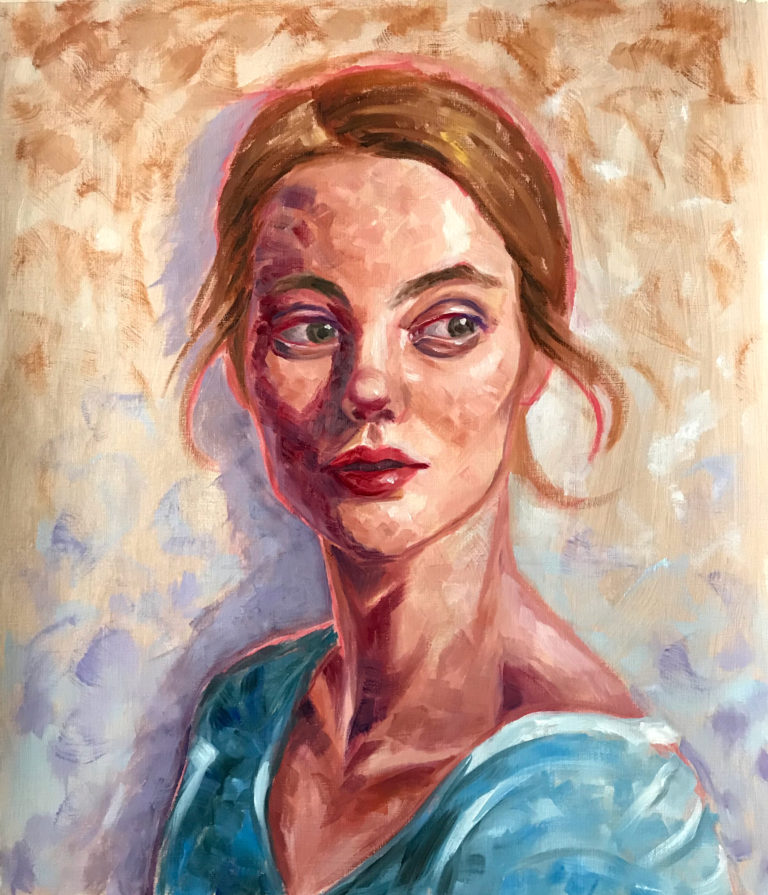

Recently, I’ve started painting portraits with oil paint. I’ve painted lots of portraits digitally in the past but has never painted one in oils. I’ve always wanted to paint like some of the oil portrait artists I’ve seen online and in art museums. I’ve watched many process videos on portrait paintings and they make it look so easy! I started painting portraits as a part of my art course and I’ve realised that painting portraits in oils is not as scary as I thought it would be. In this post, I will be going through my painting process for one of the oil portraits I’ve recently painted (see the painting above). I’ll show you the methods I used for getting more accurate proportions, how to easily mix skin tones and how I tried to be more creative and experimental with the painting.
I’ve been experimenting with loose brush strokes and colours. There’re still a lot of improvements I’d like to make but I think it’s a good start for me. I will now go through my process.
Materials:
- Canvas paper
- Acrylics(optional)
- Oil paint
- Thin round brush for sketching outlines
- Flat brushes of various sizes for painting
- Fan hog brush for background
- Zest it Turpintine Or Gamblin Gamsol
Getting More Accurate Proportions

Using a digital app like photoshop, I’ve made red grids to help me get better proportions on the reference photo. The boxes and lines will help you with getting your proportions more accurately as you will have more points of reference for positioning of the facial features, this also helps you in looking for abstract shapes which also helps a lot in trying to get something more accurate. Of course, the lines don’t have to be red, it can be any colour you want as long as you can see them clearly.
Here’s how I made the box:
I first made a rectangular box, lined up at the bottom of the chin, top of the head and the ears.

Then, to find the midpoints, I used 2 diagonal lines across the corners of the box.
The intersection point is the midpoint, I added a horizontal and vertical line through the centre point, now you have 8 equally divided triangles! You can see here that the horizontal line in the middle just happens to go across the middle of the eye! This is great as it helps you locate the eyes easier.

You can stop here if you want. But, if you want to be extra safe like me. I kept on dividing. Then I also added horizontal lines to help me locate the position of the bottom of the nose and lips.

Using this grid method has helped me a lot in getting proportions right. The most important thing is to transfer the grid with the right proportions onto your painting canvas. Measure the horizontal and vertical lines of the box and get their ratio. Then convert it to the size that you want. I measured it with a ruler by placing it on my Ipad screen to get the ratio. Then simply draw the box on the canvas with the same ratio and add in the diagonal and other lines. Of course, you can also use this method for the whole body too, not just the face.
Sketching
I first layered my canvas with some acrylics. Then with the grid, I first did a rough sketch using diluted red acrylics. Don’t have to be super accurate at this stage. For the colour, you can use anything you want, I wanted the red to show through in the end for some colour variation. If you don’t want the lines to show through, you can just paint over them later on.

Here I went in with a less diluted red acrylics for a more accurate and detailed sketch. I used acrylics as it dries faster, you can use oils if you want but will have to wait longer for them to dry. Still, don’t have to worry if the sketch is not as accurate as you want, you can always make changes later! Once it’s dried, I started painting in oils!

Painting skin tones
For the skin tones, I wanted to try having the shadowed areas a completely different colour, like the Henri Mattise painting ‘Andre Derain’. For the lighted areas of the face, I used the Zorn palette, which consists of Ivory black, yellow ocher, vermilion red and titanium white. It took me some time to learn how to use the Zorn palette but it’s really easy to mix skin tones once you’ve learnt it! For this portrait, I want to use more saturated and red colours, so I mainly used mixtures of yellow ocher, vermilion red and titanium white, I didn’t use much ivory black as it would tone the red colours down.
Here you can see me just trying to block in colours with some rough colours. I’ve decided to use purple for the shadow areas. For the loose brush strokes texture that I’m looking for, I used mainly flat brushes and short brush strokes.

As you can see here I’ve made the skin tone redder on the light areas. Also, the brush strokes looks a lot looser.

After painting in the skin, I started on the hair and top. I changed the colour of the top to a more saturated and brighter blue colour for some colour contrast against the hair and background, also for more colour variation. I had to keep reminding myself to not over blend and kept at it with the loose brush strokes. I used purple for the background shadows, it looked too dark here and was taking away attention from the portrait, so I lightened it later on.

Lastly, I added in some background textures with a hog fan brush.

I hope you’ve learnt something new from my oil portrait process tutorial that’s useful to add into your own painting process. Portraits are really fun to paint either using oils or digitally. Now that I’ve finally started painting portraits in oils, I realised that it isn’t as scary as I thought it’d be, I really enjoyed it. I look forward to painting more portraits in oils and sharing my process here on my blog. If you purchase anything through the affiliate links that I’ve provided, I get a small amount of commission(at no extra cost to you!) which helps me to continue writing art-related tutorials like this one.
You may also be interested in: